Rêvers for a Better State Flag

How might we create a flag design that accurately and respectfully reflects Minnesota's shared history, resources, and diverse cultural communities?

ONE OF THE WORST FLAGS

In 2001, Minnesota’s state flag was rated one of the ten worst flag designs in the US and Canada by the North American Vexillological Association (a fancy name for flag experts). Since then, legislators have drafted bills to redesign the flag for 22 years. Enter Minnesotans for a Better Flag 2023, the flag redesign competition for submissions by Minnesotans.


At Rêve, we are experts at designing products, services, experiences, and entirely new businesses – so we thought, “Why don’t we try to design the new flag?” So, the adventure began. Our talented design team led us through a 2-hour design sprint that included discovery, design, development, and a great Minnesotan-themed snack bar.


We documented our process, output, and our learnings. In the end, we came up with three distinct flag designs that embodied the spirit of Minnesota. We are proud to have played a small part in creating an iconic Minnesota symbol.

THE ART AND SCIENCE OF FLAG DESIGN

Safe to say no one on our team has designed a state flag before. So we consulted the world’s largest organization of flag enthusiasts and scholars, The North American Vexillological Association. They wrote the book on “Good” and “Bad” flag designs – literally. In the book, they explain the five basic principles one should follow when designing a flag.

  1. Keep It Simple.  The flag should be so simple that a child can draw it from memory.
  2. Use Meaningful Symbolism.  The flag’s images, colors, or patterns should relate to what it symbolizes.

  3. Use 2 or 3 Basic Colors.  Limit the number of colors on the flag to three which contrast well and come from the standard color set.

  4. No Lettering or Seals.  Never use writing of any kind or an organization’s seal.

  5. Be Distinctive or Be Related.  Avoid duplicating other flags, but use similarities to show connections.

The current state flag breaks about every design principle. We approached this design challenge in a similar to way to how we would approach a design challenge from a client. We asked ourselves: “How might we create a design that accurately and respectfully reflects Minnesota’s shared history, resources, and diverse cultural communities?”


From Service Design to FLAG DESIGN

We drew inspiration from our service design methodology, starting with understanding the problem, then ideation and prototyping, testing and refinement. Traditionally, we would also assist with the implementation, but we knew that would be up to the state committee responsible for selecting the final design.


Our team brought their lived experiences of being Minnesotans – some of us are lifelong Minnesotans, while others have only recently relocated. We used a human-centered approach to design a flag that resonates with the people it represents, capturing both the shared and diverse culture, history, and aspirations.

OUR APPROACH

Level Set

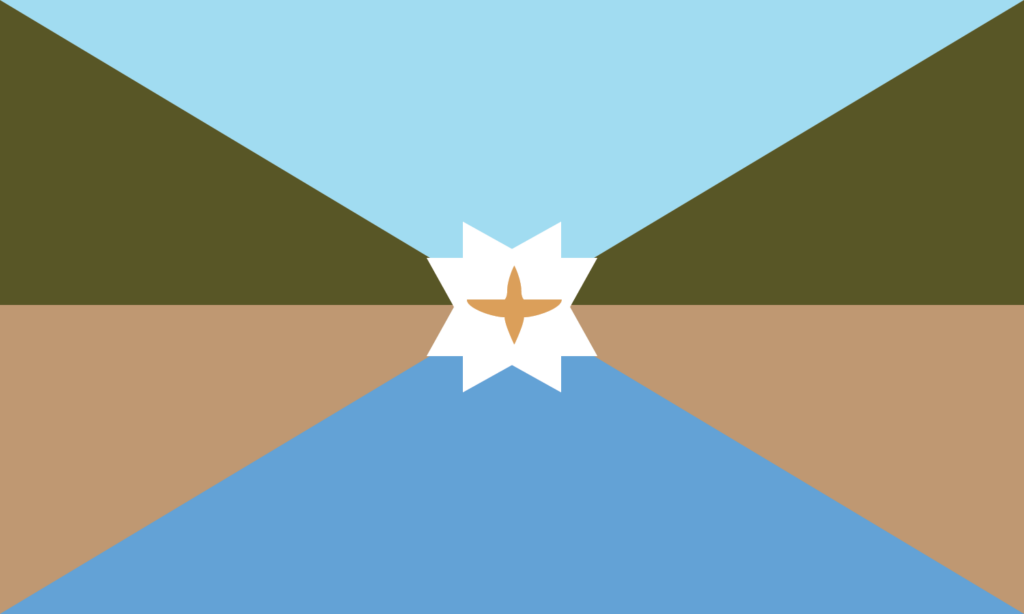
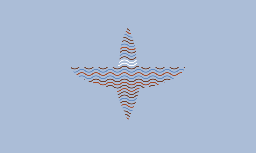
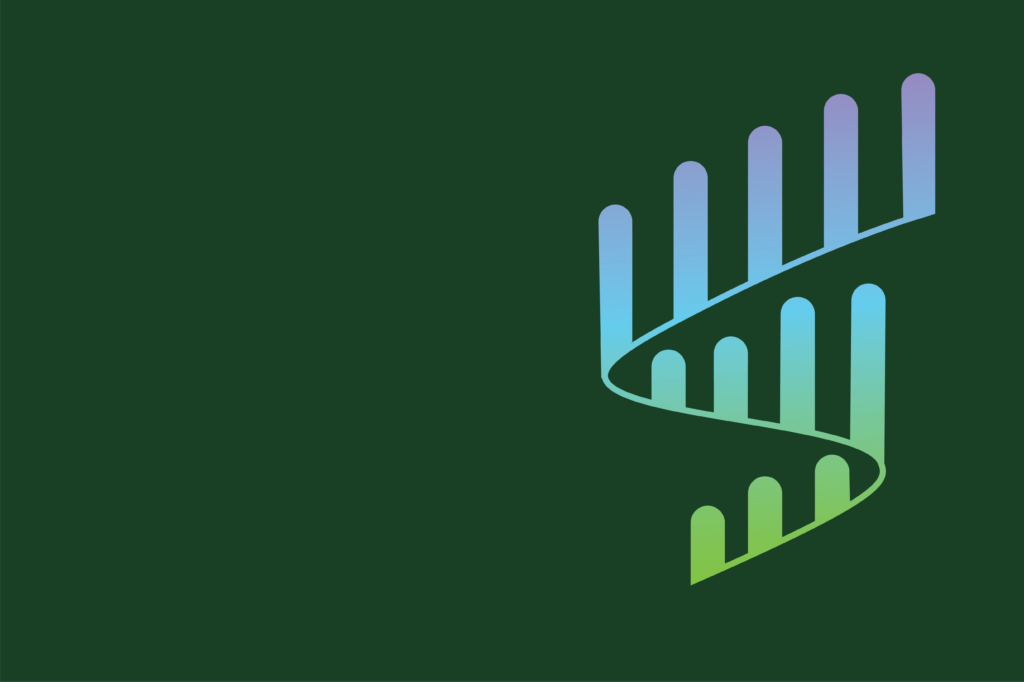
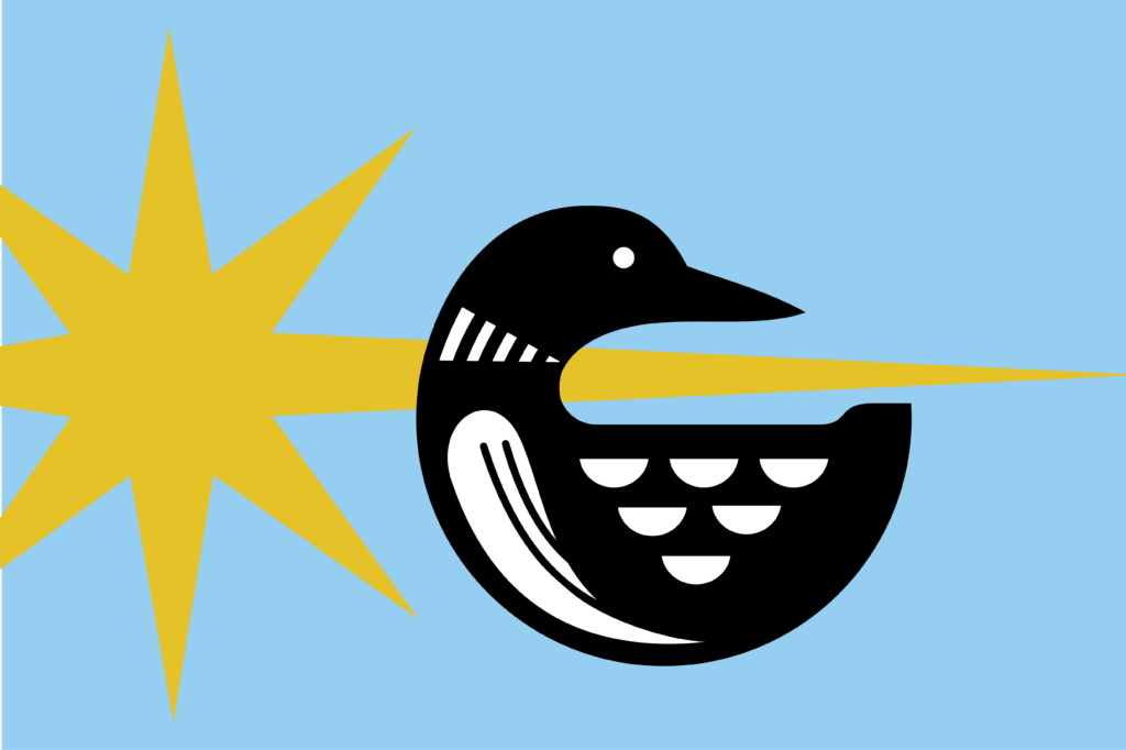
We discussed the current flag and identified what was working and what wasn’t. We agreed the current flap was too busy, outdated, and didn’t capture the vibrancy and culture of the 10,000 lake state.


Design Principles

In addition to talking about the Minnesota state design parameters, we looked at best practices when it comes to flag design. We discussed the importance of symbolism, simplicity, and legibility. We also reviewed the importance of using colors, shapes, and symbols that represent the state’s unique identity. Finally, we discussed the importance of creating a flag that is both visually pleasing and easy to understand.


Element Ideation

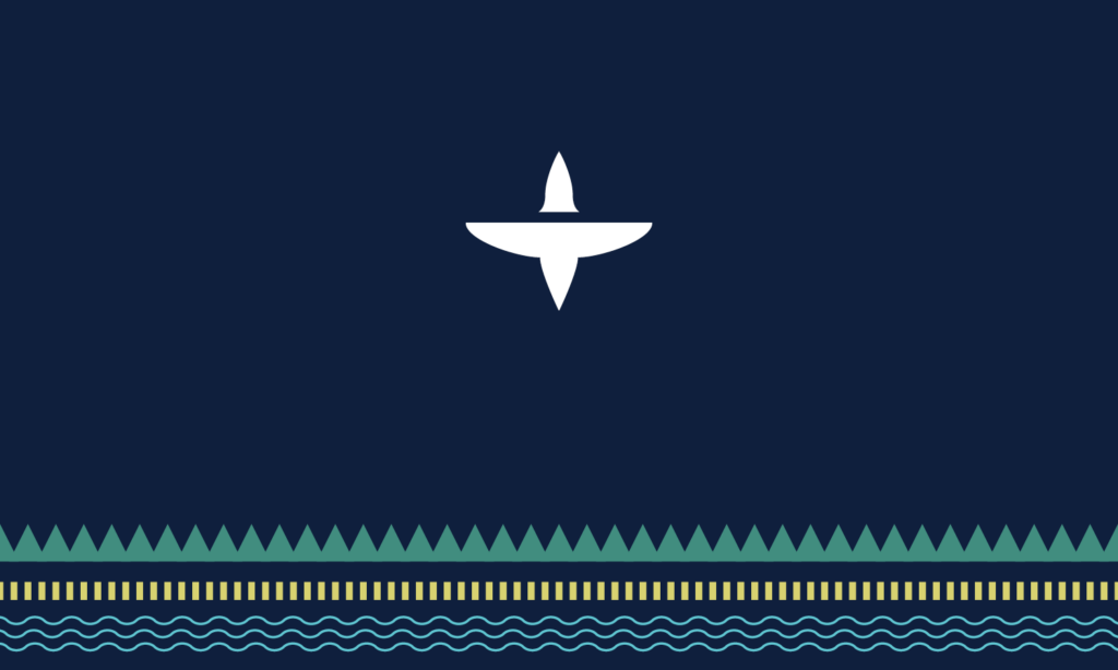
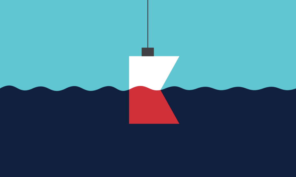
We brainstormed on a whiteboard elements that came to mind when we thought of Minnesota, breaking them into five categories: symbols, landmarks, animals, nature, and colors. This element bank would serve as inspiration for the team to use in their designs.


Sketch > Iterate x2 

Our team did two rapid rounds of sketching and iteration to bring our brainstorms to life. After ten minutes of sketching, we were paired off to discuss our designs and make changes. Even as seasoned pros of service design, we had to remind ourselves messy is okay; get your ideas down on paper.


Shareout & Prototype

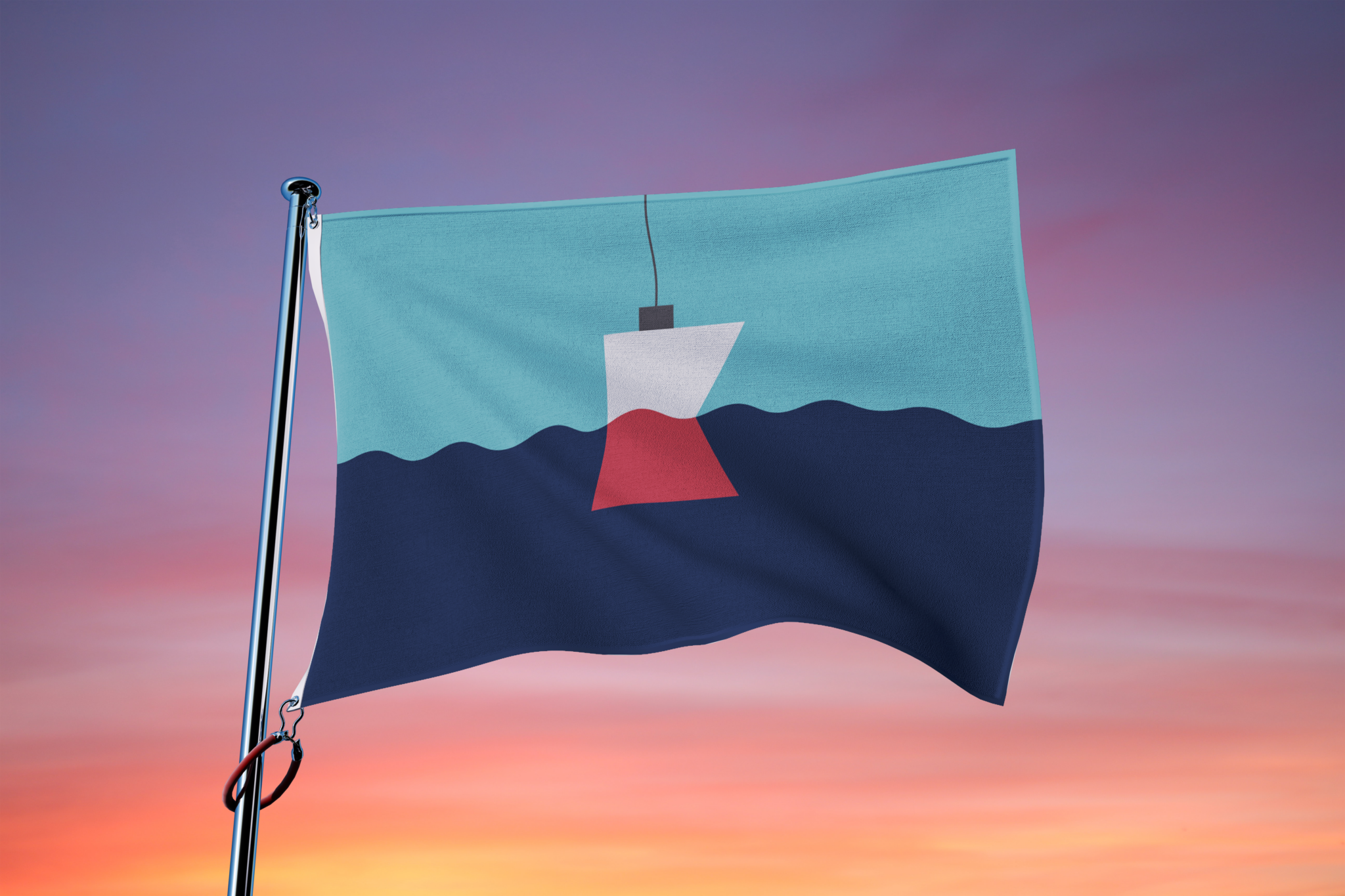
Once we had completed the design session, we gathered as a team to share our creations. After sharing our designs, our design team took the sketches offline and digitized them for final submission to the state.

UNVEILING OUR DESIGNS

Here are the designs we co-created and what Minnesotan symbols inspired the designs:

Landscape Patterns

Bobber

Mouth of Mississippi

Agate Rock

Northern Light Flare

North Star Loon

A vision for the future

Whether it’s flag design, service design, or capability design, our team shows up creatively and collaboratively. Visit our services page to see how we can help you create a better way of working. We prioritize user experience and usability to ensure the best outcomes for our clients. Our team of experienced professionals can provide you with tailored solutions to meet your specific needs. Let’s work together to create a brighter future.

put humans at the center

Need Help Making Your Strategy Human-Centered?